Metyet - An astrology based dating app
Research and Design
Nov 2019 2018 - Feb 2020
The Problem
Metyet is an astrology based dating application that explores and connects individual based on stars, signs and Birth charts. It motivates users to go beyond and indulge in personality insights based on birth chart predictions rather than just swiping left and right based on profile picture. The challenge was to create and build a design system for the new dating app that focus on creating meaningful connection. Our primary focus was to create an intuitive and seamless experience that aims at empowering individuals to develop a more meaningful relationship in today’s fast paced world.
Research and Planning
In our first client meeting, we discussed the scope of the project and worked to identify how our team could best help them accomplish those goals (given our limited timeframe).
We began the project with secondary research and competitive analysis.To comprehend the needs and preferences of our application's target demographic, aged between 18 and 35, we opted for a direct approach – conducting interviews.
Insights from the research
90% of interviewee have met someone in person via online dating apps among which 70% believed in astrology.
Some users wanted to know more about the person before dating.
60% of the interviewees said that sometimes it’s frustrating to find the perfect match as you know about that person after few meeting and the loop continues.
Some users found its confusing to use dating apps with so many options and buttons.
Most of the interviews believed in astrology and found it frustrating as the current dating apps where superficial.
Userflow
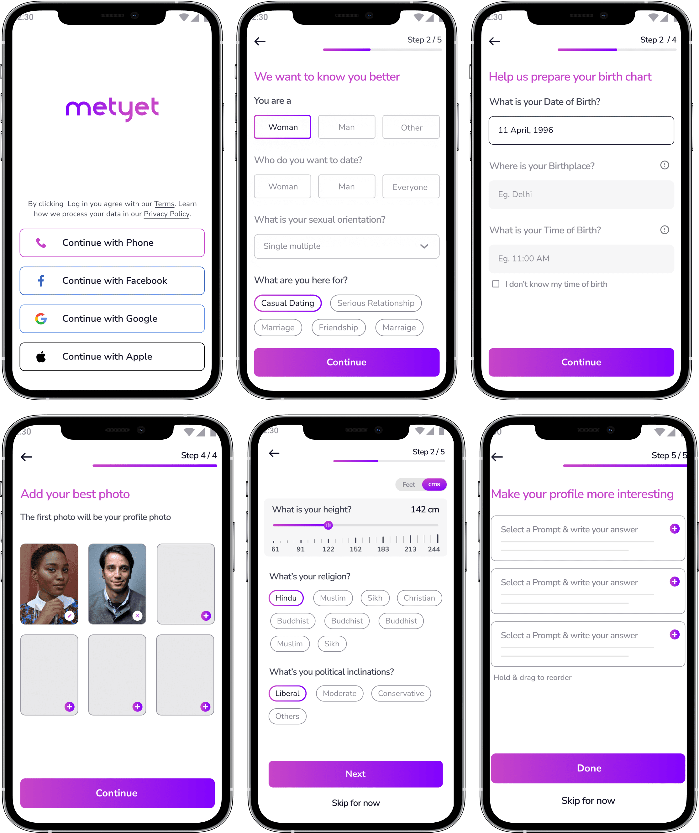
Based on our research and client discussion I created user flow to explain the navigation of the application. We divided the onboarding questions in two stages with the aim to make it engaging:
In the initial section, users answered basic questions and provided their birth data.
The second part went deeper into understanding the user's personality, exploring areas like their preferences, interests, and more.
Userflow : For detailed view Click here
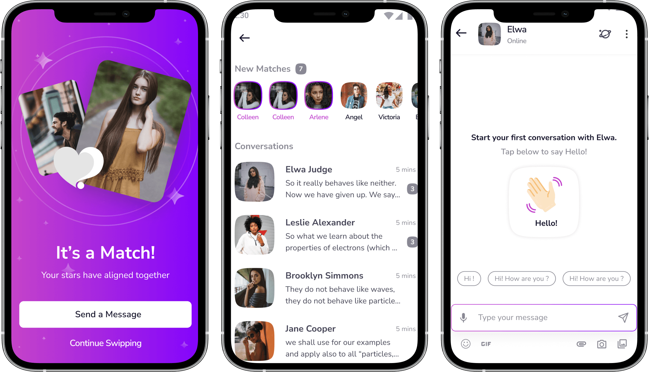
Design System
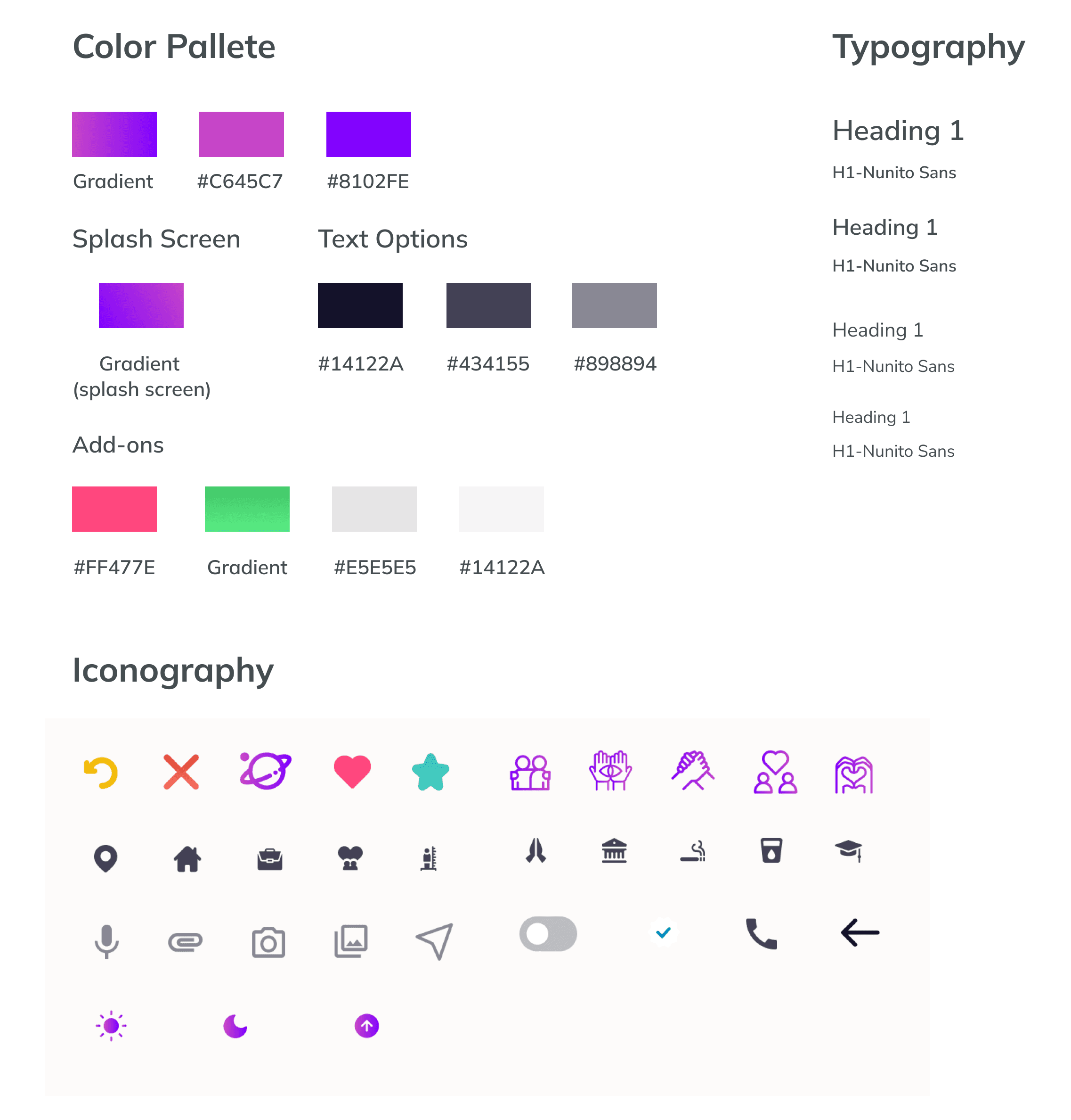
We came up with a design system to add consistency, structure and communication across all team members. We chose simple readable humanist typeface that would improve reading legibility at both small and large sizes. The colour palette is creating a sense of excitement with good contrast. We also implemented icons and friendly illustrations to bring some fun and enjoyment to the app.
Visual exploration
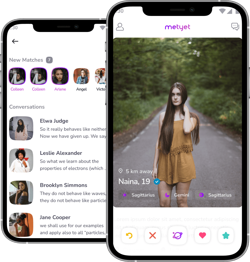
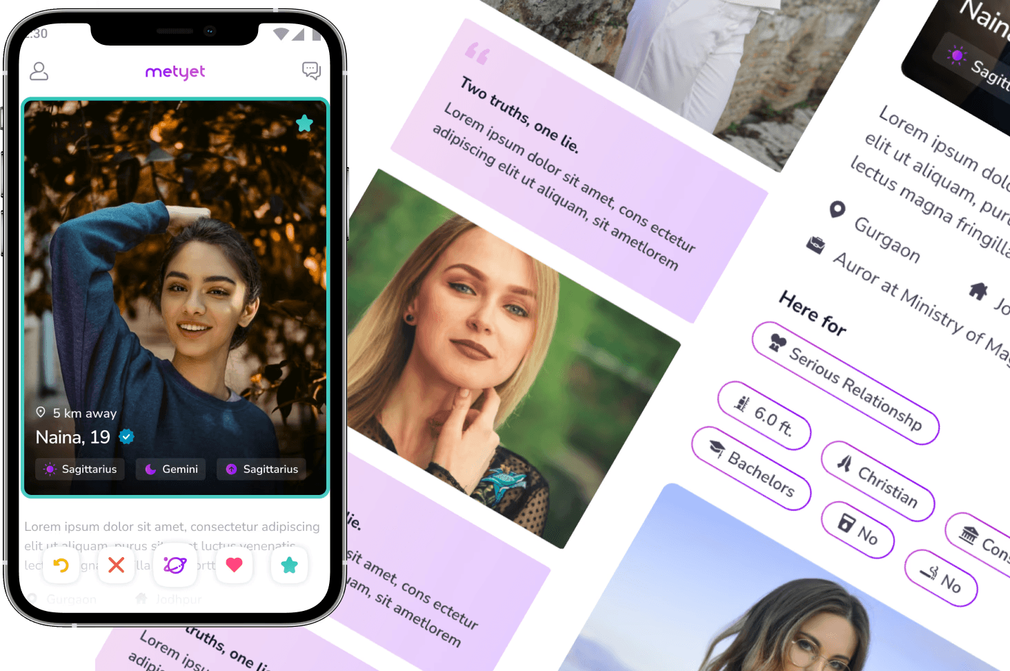
Profile - I explored different options for profile and after few brainstorming sessions agreed on the one that would be minimal and encourage users to explore the profile by giving blurry text below the profile picture. We chose the button shape as “squircle” as it gave a modern look as well as create a sense of excitement.
Compatibility - We wanted the compatibility screen to be visually appealing showing different compatibility parameters visually. In later stages we wanted it to look simple(so that users do not get confused) yet aesthetically pleasing going with the overall flow of the application.
Final visual design
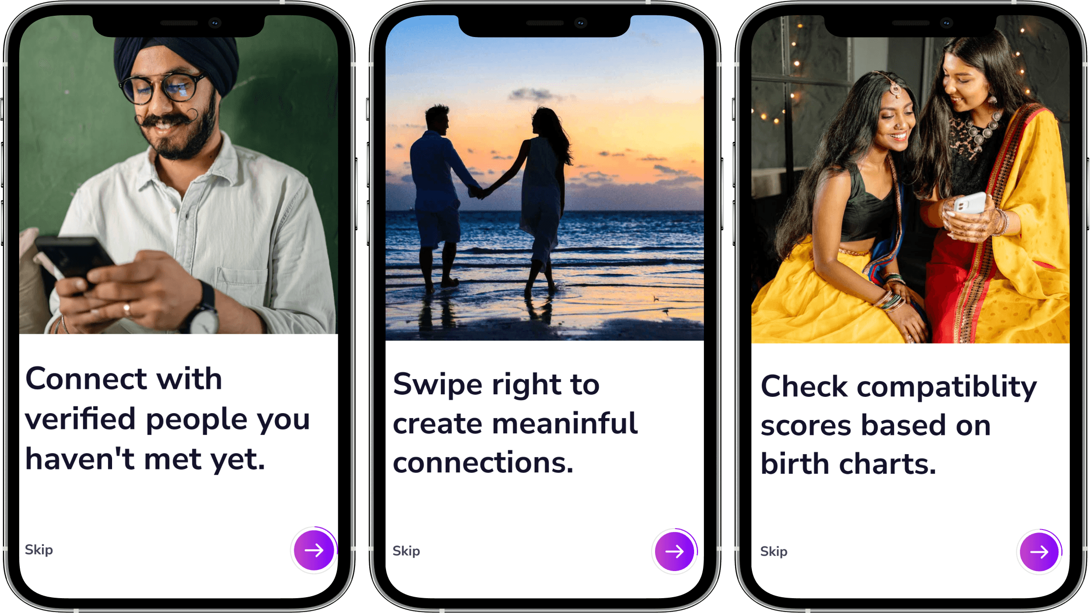
Onboarding - I designed a welcoming walkthrough and guided tutorial to help users ease into the product’s experience, introducing all the critical features and elements.