Stelda - Website Redesign
Research and Design
Apr 2021 - Apr 2021
The Problem
Stelda (Security Tamper Evidence and Low Damages in Transit) are market leaders in graphic art industry-bookbinding in South Asia and Africa who strive to solve packaging pain points and automation operation. They approached us for the complete redesign of their website to mark their presence digitally and improve the user experience as well as content of the current website.
Analysing the current website
I started the design process by analysing the current website and identified the issues on each page which needed attention. Additionally, I identified areas that required attention and devised strategies for improvement.
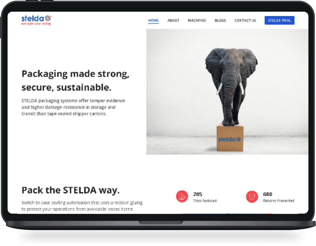
Homepage
Objective Clarity: The company’s objective is not immediately clear on the homepage, making it difficult for users to understand the core value proposition.
First Impression: An initial image is displayed but lacks messaging to communicate value, which leaves users unsure about the purpose of the website.
Lack of Call to Action (CTA): There’s no CTA guiding visitors to other essential pages, such as products, contact, or about us, which can limit engagement.
Connection with Audience: The homepage misses sections that build trust and connect emotionally with users, impacting overall engagement and credibility.
About Us- The content on the about us page is poorly structured and difficult to understand. It can discuss their Story, Milestones, Team Members, and Organizational Values.
Currently the images of the products which are used in this page can be removed as here the main focus should be on the core values, culture and how they work (as a team). Images of team members, organization can be used.
Products and Product details - Product detail page is content heavy, making it overwhelming for users. Using visuals to explain the specifications can reduce the cognitive load while also improving the design appearance. If visuals aren't available, the content should be reorganised to get the most out of it while avoiding eye strain.
Navigation - Navigation is extremely important so that users are not lost in the website. Currently the top navigation is not working, if user is on the "About" page (let's suppose by mistake),they won’t be able to figure it out.
The website needs a redesign not only to make it aesthetically pleasing but also informative. The images, content(not the technical content but as mentioned above to make it catchy and at the same time convey the idea clearly), colour needs to be worked upon.
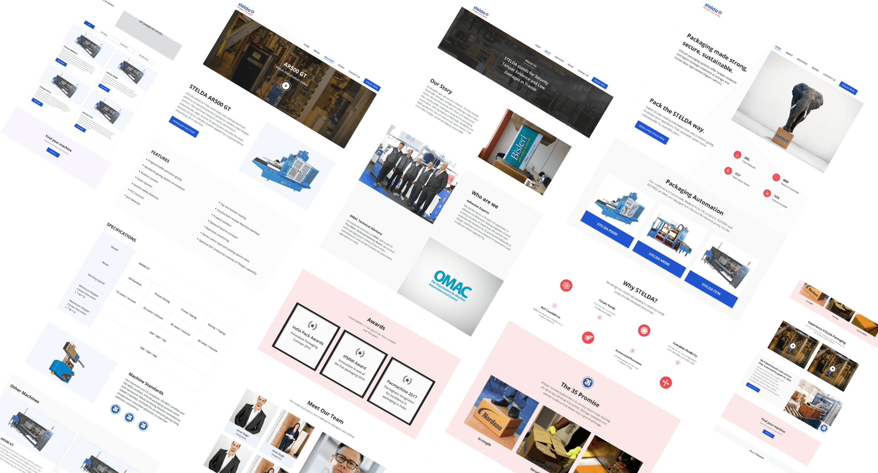
Visual design
After few iterations and discussions with the client, taking into consideration the requirements of the business, the following designs were given the approval.